NFL
Philadelphia Eagles Unveil Updated Team Name Art for 2022
The Philadelphia Eagles showcased a new team word mark design on June 16, updating the design that was used for the past two decades. The new design simplifies the bold, […]
 Sakmann News, Entertainment and Sports
SNES Blog Network
The Philadelphia Eagles showcased a new team word mark design on June 16, updating the design that was used for the past two decades. The new design simplifies the bold, […]
The Philadelphia Eagles showcased a new team word mark design on June 16, updating the design that was used for the past two decades.
The new design simplifies the bold, flashy word mark for a clean, sleek, stringent design.

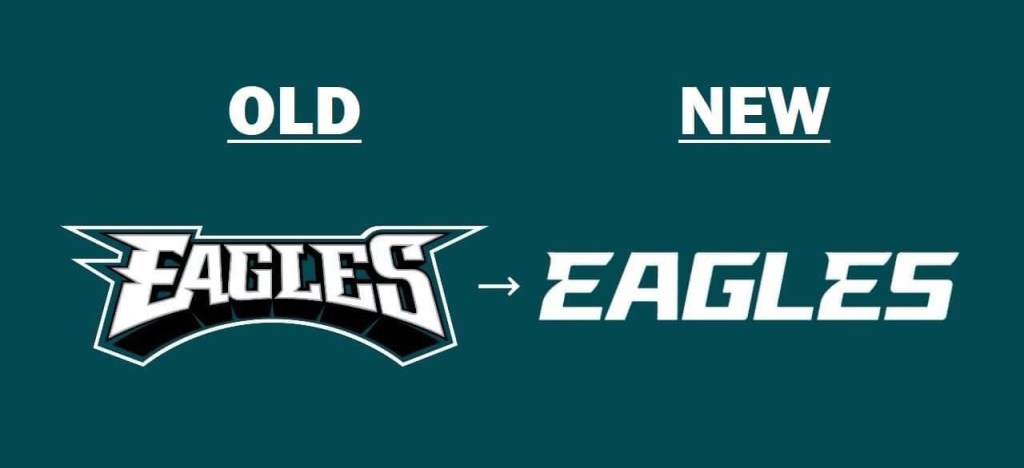
What do you think of the Eagles new team name art? Is it an upgrade or a downgrade? Personally I prefer the old art, as the new one looks too corporate and takes away from the Eagles character that the old design showcased. There’s still subtle Eagles references, represented by indents in the letters, but overall, Philadelphia’s new design follows a trend away from character-driven logos and team art towards a more corporate, uniform look.
To share your feelings on the Eagles new art, be sure to connect with Sak Sports Blog on Twitter or on Facebook.
Header Photo: Jeff Skversky
Be sure to follow Sak Sports Blog on Twitter or on Facebook for more NBA and NFL updates!